Intro

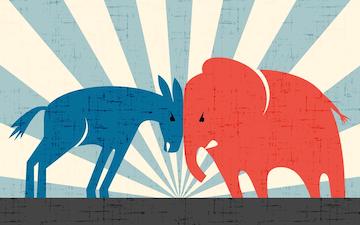
Ever since the 2016 General Election, I have been fascinated with how data can allow us to easily understand why certain candidates perform better than others. I have grown to appreciate data visualization through reading platforms such as 538 and the NYTimes. I appreciate how data visualization can be used to tell a story, and these sources have inspired me to tell a new story about elections through data by myself, which is why I enrolled in Data Visualization, and it is also the motivation for this project. As you read through this project, you will gain a better understanding about historical trends and indicators of U.S. national election results.

Presidential Election Results Throughout History

It can often seem like there is no trend to American Presidential Election Results. However, after analyzing the above graph, we can conclude that the American electorate almost always pushes back against and "punishes" the current party in power. No matter which party is currently in control of the White House, it is almost guaranteed they will lose that control in the next two general elections. If we take into account the political state during the 1980, 1984, and 1988 presidential elections, it would seem like a near-impossible feat for Democrats to regain control of the White House. In each of these three elections, Republicans won almost more than 300 electoral votes than the Democrats, and 1992 also had a Republican incumbent (Bush). However, no matter how in-control a party may seem, nobody is invincible to the American Electorate's infamous pushback that I have previously described. Thus, in 1992, Bill Clinton won back the Senate and the White House for the Democratic Party. This back-and-forth between Republicans and Democrats holding control has continued in every other election up to the previous election in 2020.

Comparing Midterm and General Election Correlations

It is a popular belief to think that midterm elections can predict the outcome of the next general election. However, that is not always the case. Because the national midterm elections only have the U.S. House and 1/3rd of the senate up for election, voters tend to care more about local issues over national issues. Additionally, there is always a much smaller turnout for midterm elections than there are for general presidential elections; only about 40% of eligible voters actually vote in the midterm elections, whereas ~60% of voters usually vote in the general presidential elections. You can see the results of the correlation of elections in the parallel coordinates chart below. There are 100 total Senate Seats, so each Senate Election axis value aligns with how many seats each party has after the listed election. I have also converted the Presidential Election Electoral Votes into a percentage; thus, the presidential election axes are out of 100% of the electoral college. In this chart, each party therefore only needs 51% to win the election.

After viewing the parallel coordinates graph, we can now begin to dissect why the elections in the late 90s had these results. The 1992 Senate and Presidential elections are highly correlated, and democrats performed well in both elections. This is due to the fact that Republicans currently held office at the time of the election, but the economy was beginning to sour. At this point, America had a Republican as president for over a decade, and there was also a growing call for change and progress. Thus, because of America's desire for progress and frustration for economy, George H. W. Bush became a rare 1-term president, and Bill Clinton defeated him and won back the Senate for the Democrats. Because Democrats had control of Congress and the White House, they were able to push forward with their more liberal agenda, and it began an era of progressive ideology. All was looking well for the democratic party, but as the party became more liberal, the American electorate began to push back. The 1994 Midterm Election shows that Republicans were able to win back the Senate in the "Republican Revolution," also known as the Red Wave. This is because Clinton pushed for liberal policies that were unpopular at the time, such as allowing homosexual people to serve in the military. At the time, according to Pew Research, only 27% of Americans were in favor of homosexual people serving in the military. Clinton saw America's refutal of his policies in the midterm election, and he began to compromise more with Republicans on conservative issues. To continue his fight against the infamous electoral "push back", Bill Clinton signed the Defense of Marriage Act, which defined marriage as being between one man and one woman. His continuous compromises with Republicans may have saved him, as he easily won reelection in 1996. However, Democrats still did not win back control of the senate. This is indicative of my findings that midterm and Congressional elections do not correlate to General Presidential Election outcomes, contrary to popular belief.

House Seats Lost Based on Current President

As we saw in the Parallel Coordinates Graph, the Midterm Elections and General Congressional Elections do not always correlate to the outcome of the presidential election. However, I argue that although we cannot predict presidential elections from midterm election results, we *can* predict midterm election results with which party currently controls the executive branch. This can be seen in the bar graph above, where the party of the current president almost always loses seats in the House of Representatives in the following midterm election, no matter the current president's approval rating. The higher the approval rating of a president, the less seats his party will lose, but it will almost certainly result in a net loss of some amount. Thus, we can predict the outcome of midterm election based on the current president, but not vice versa. This results in my hypothesis that America tends to stay moderate and welcomes change very slowly. This is why we see a "pushback" of a president's party in the midterm elections; it is a popular hypothesis that the American electorate realizes they need the competing party to keep the President's party in check.

Comparing Demogaphics to 2020 Election Results

Can Education and State Population Predict Election Results?

It is extremely common to hear the media repeat that college-educated voters as well as highly-populated states tend to vote "blue," or for democratic candidates. To determine if this is true, we can look at the bubble graph above and visualize the correlation between different states' education levels and their likelihood of voting for a democratic presidential candidate. Immediately, it is clear that there are two clusters between the states that went blue in the 2020 election and the states that voted for a republican. As we look at the data, the highest-educated state--Massachusetts--voted for Biden with 65.6% of the vote. The least educated state--West Virginia--only voted for the democratic candidate with 29.69% of the vote. Overall, there is a linear correlation between education levels and likelehood of voting for a democratic candidate. However, it is not possible to draw a similar conclusion when looking at a state's population, as the second and third most populated states voted for a republican. These findings can shed light into each party's platform. Through bills such as the Build Back Better Act, democrats are consistently trying to increase access to education, whereas republicans regularly try to critique higher education. This makes sense, as each party knows its constituent's demographics, and they want to expand upon them.

Conclusion

The Effect of America's "Push Back"

After viewing and analyzing the visualizations, there is a clear indicator to which party will win the next election: whichever party is currently in control of the White House and Congress will likely lose control in both branches of government in the next election without an incumbent. Whenever one party controls all branches, they tend to push their more extreme policies, and the American electorate has thus recognized the importance of a competing party. When looking at which people are more likely to vote for one party over another, it is evident that voters with a bachelor's degree are more likely to vote for the democratic candidate, whereas those with only a high school degree are more likely to vote for a republican candidate. This fact, coupled with the election results and other demographics, directly impact both party's policies and platforms.